Sequential Figure & Ground
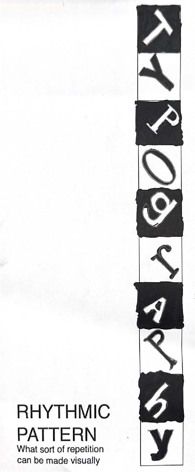
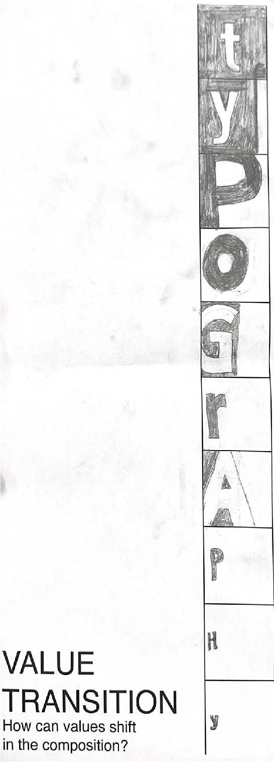
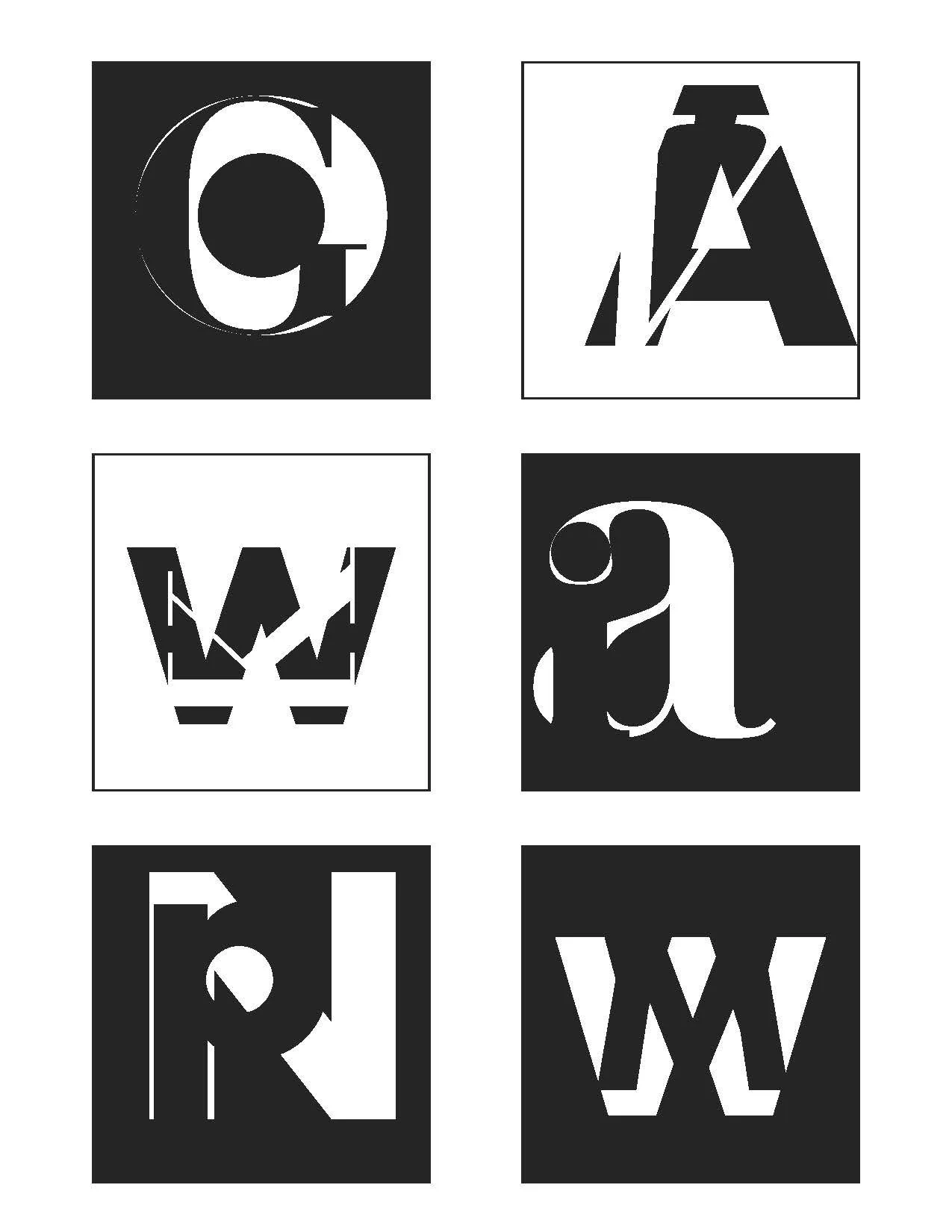
This project explored how letterforms interact with space using balance, scale, and proportion. Each box had to include both a number and a letter—one in white, the other in black—using positive and negative space for contrast. I experimented with placement, type size, and visual flow, guided by Gestalt principles like proximity and closure. After two full redesigns based on critique, I refined my layout to strengthen visual unity and legibility. A big discovery was how changing the size relationship between letters and numbers could transform the look of a box. While I originally planned for letters to always dominate, mixing it up led to more dynamic results. I also noticed how some layouts created optical illusions depending on type choice and positioning. One of the biggest challenges was balancing creativity with legibility—it took hours of tweaking. Overall, this project sharpened my eye for spatial relationships and pushed my creativity with letterform design.


Changed
Same
Before

After


Individual Sections
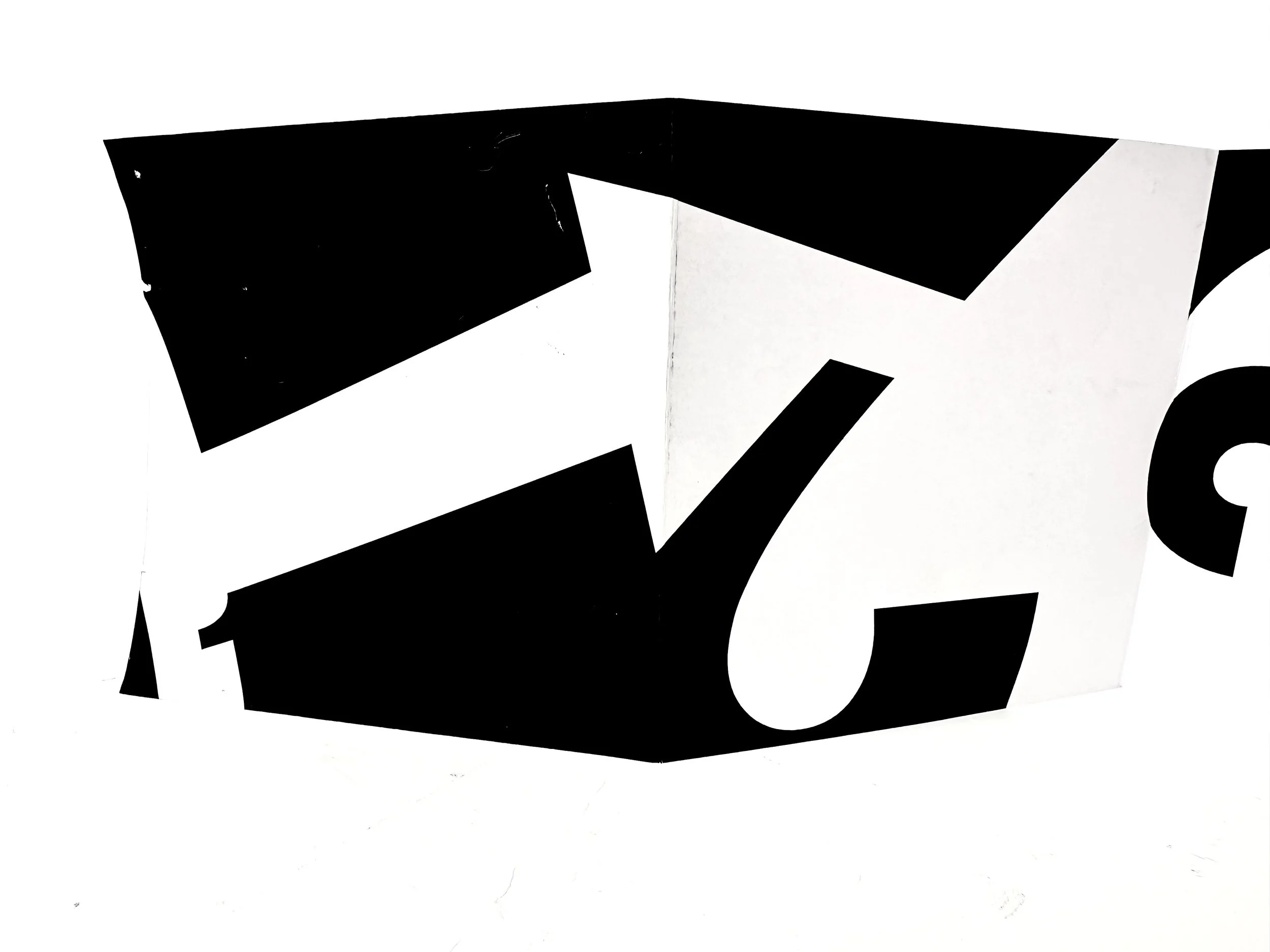
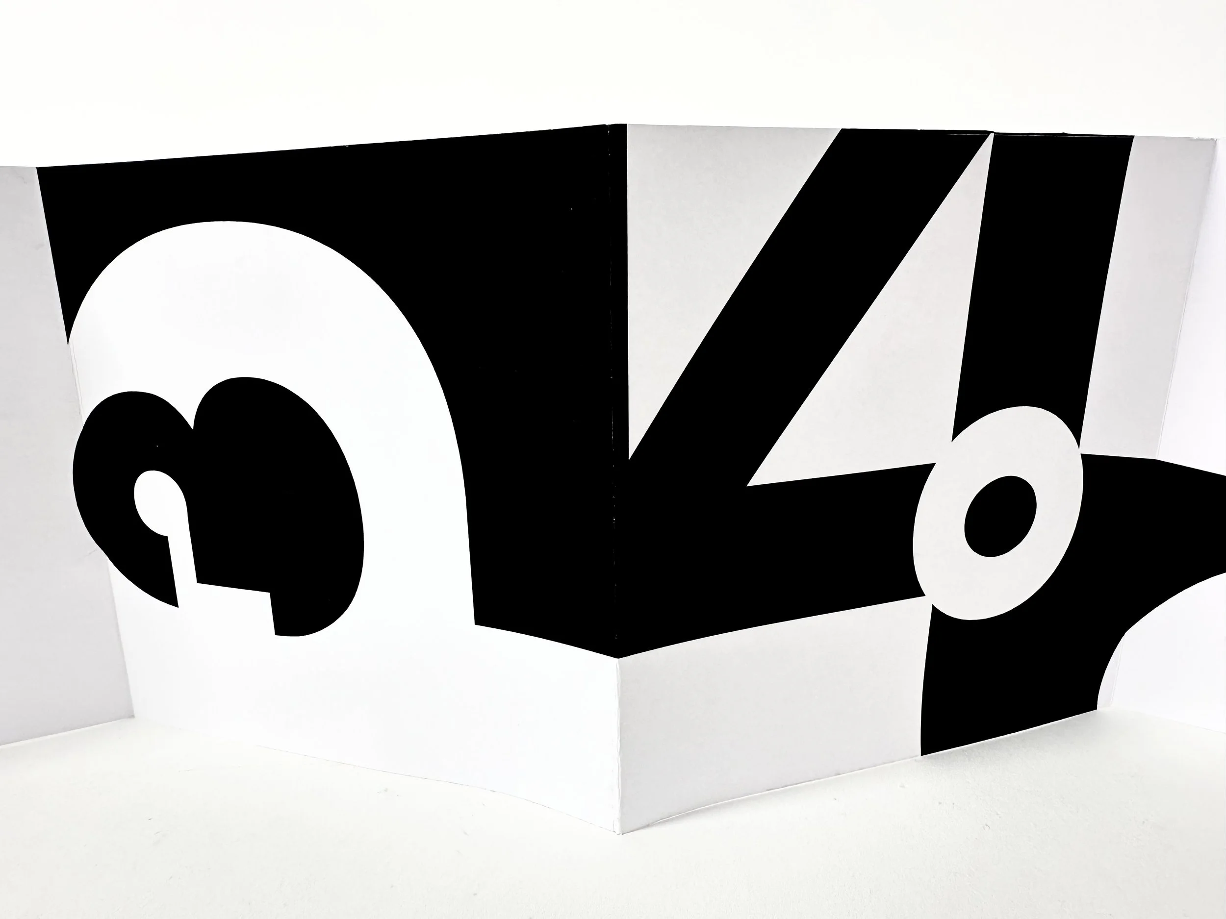
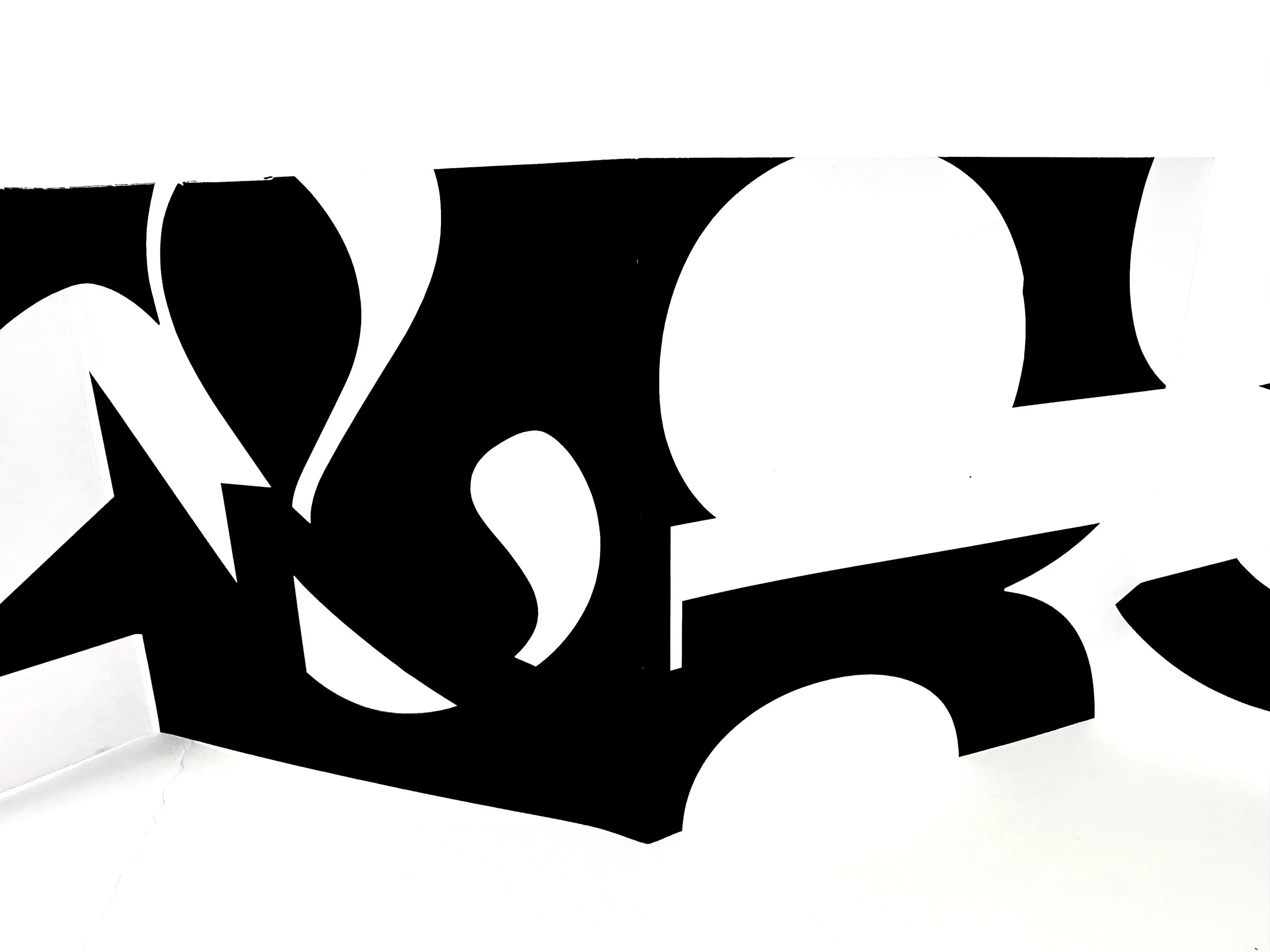
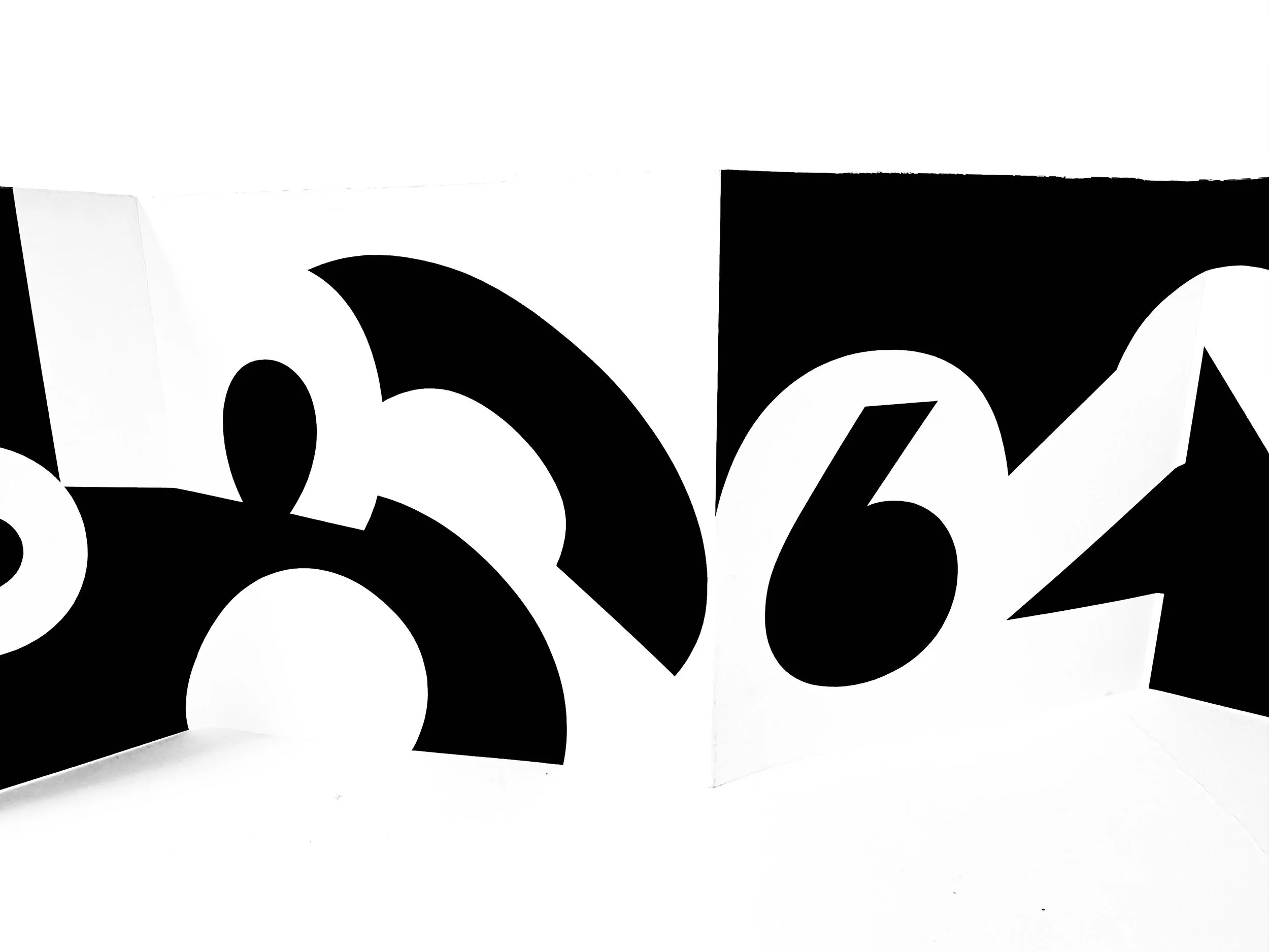
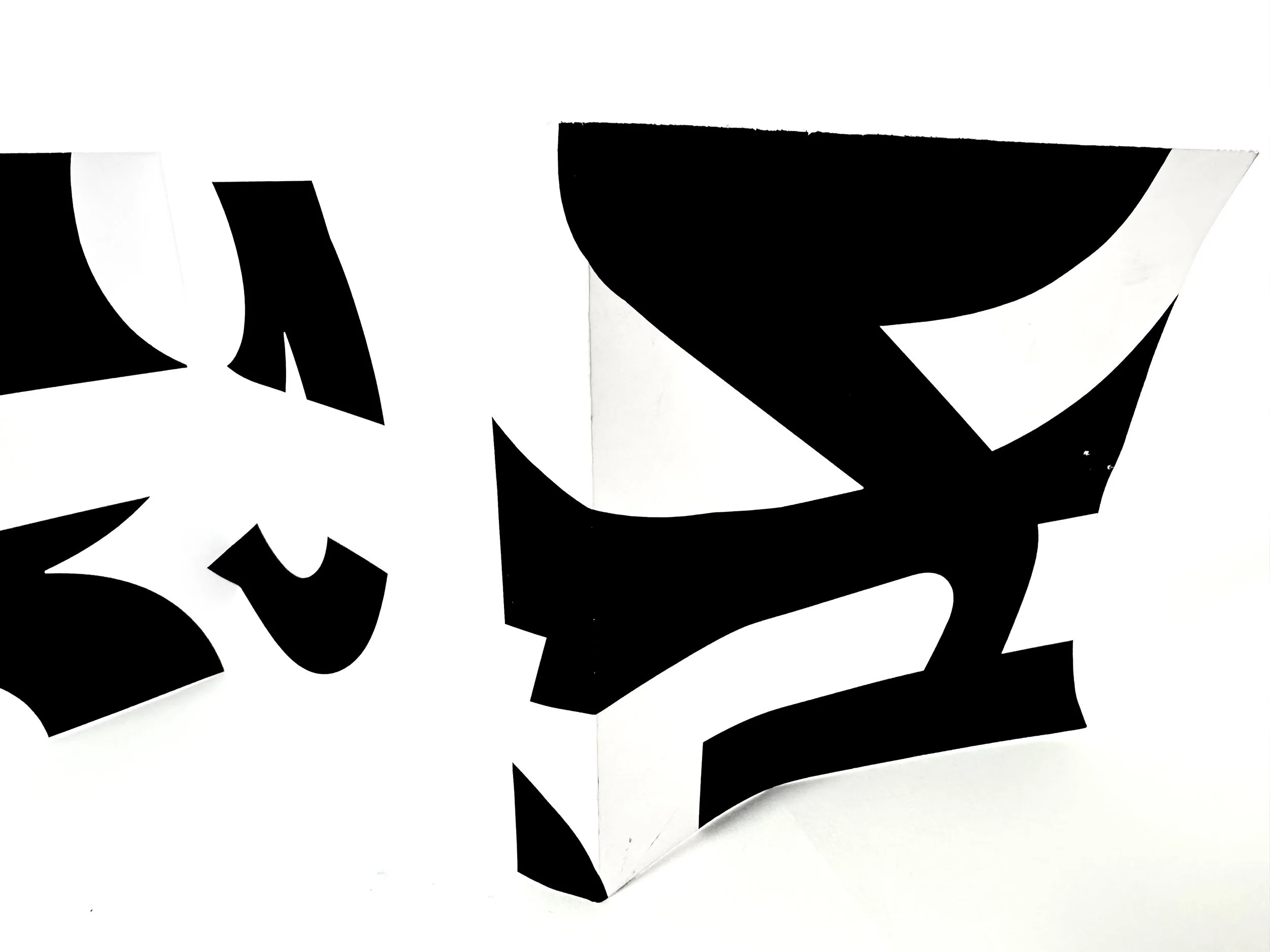
Figure and Ground Explorations