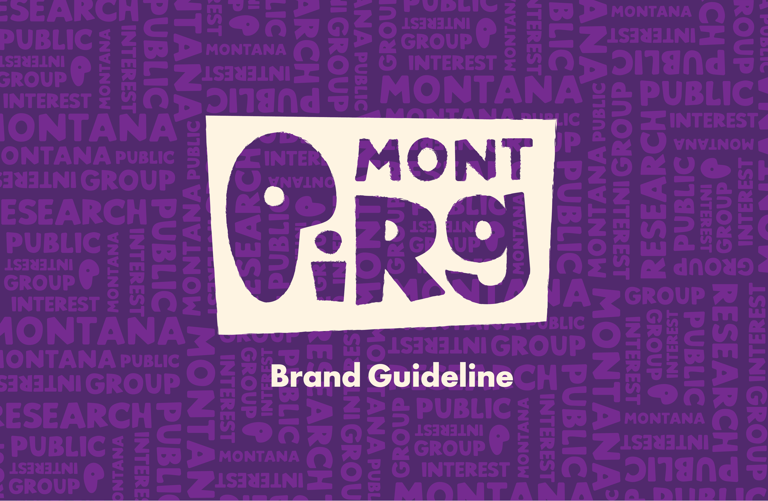
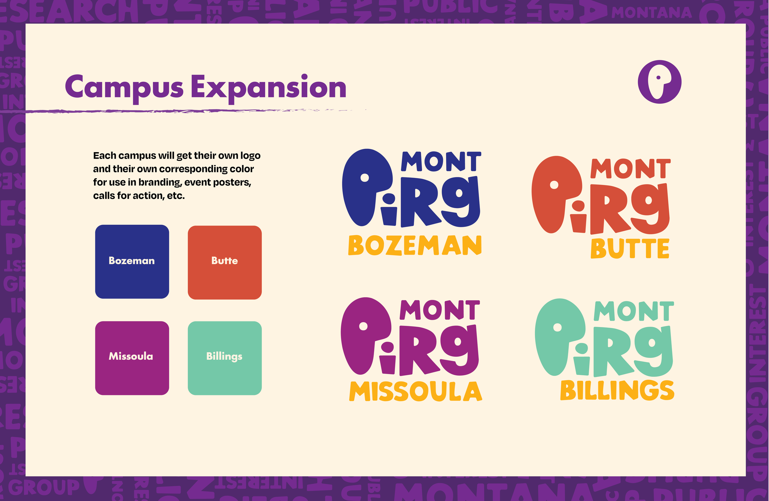
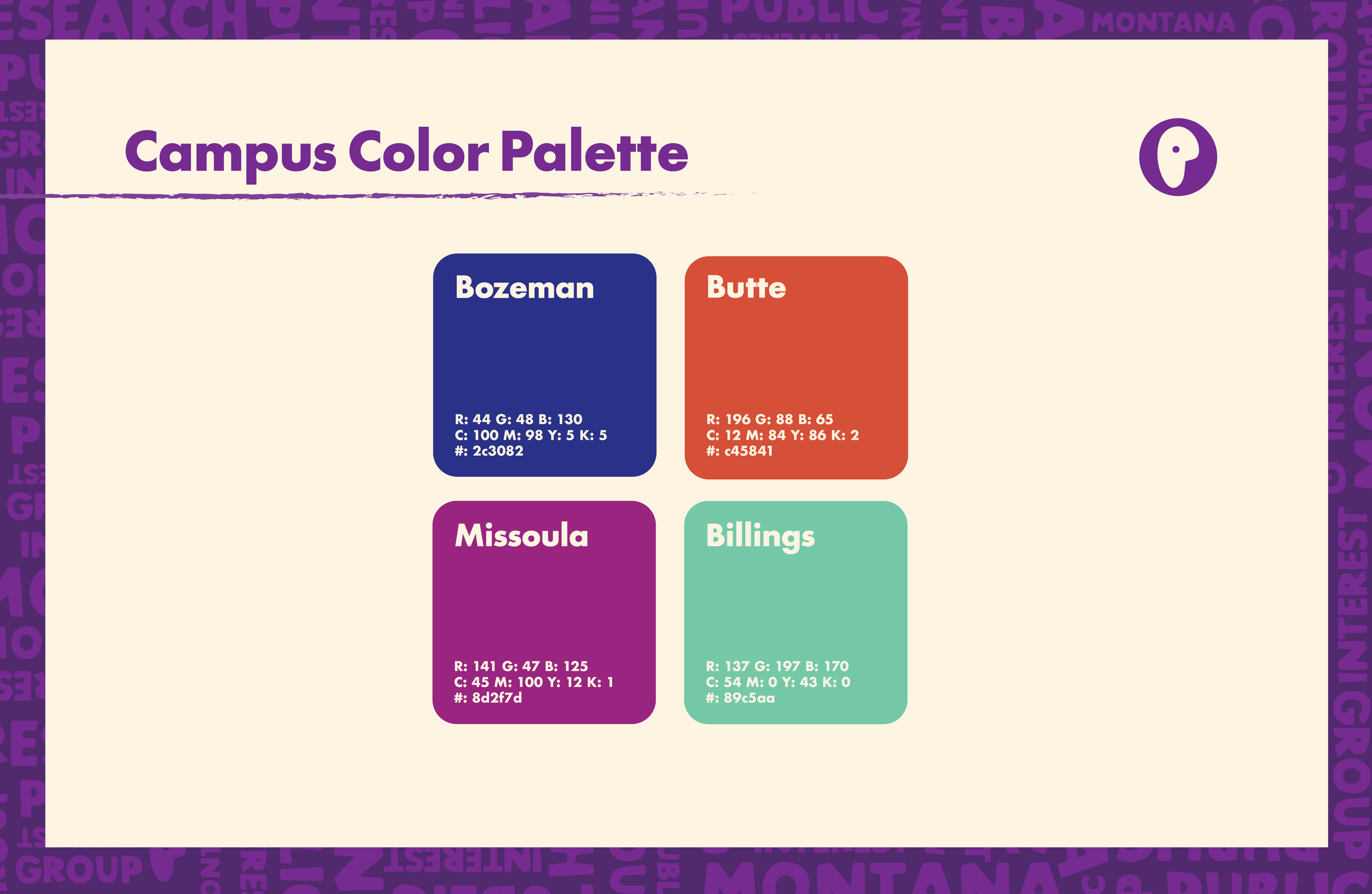
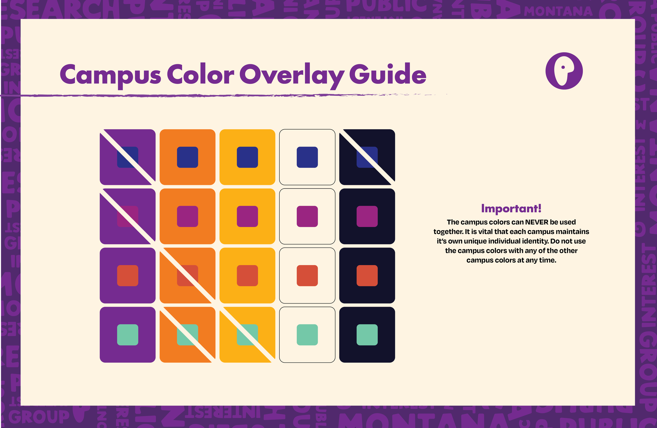
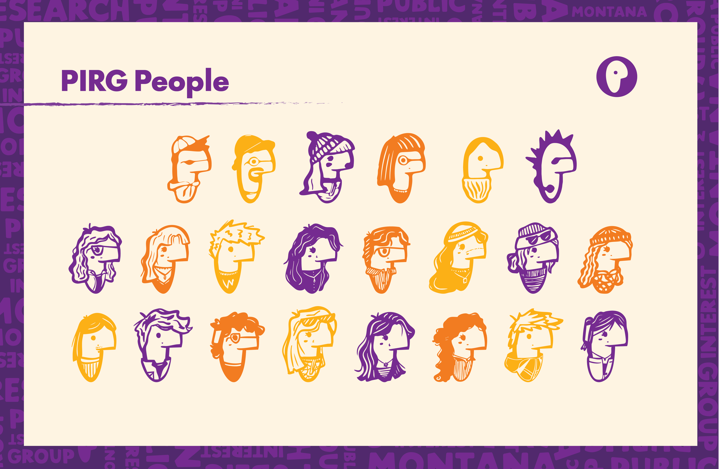
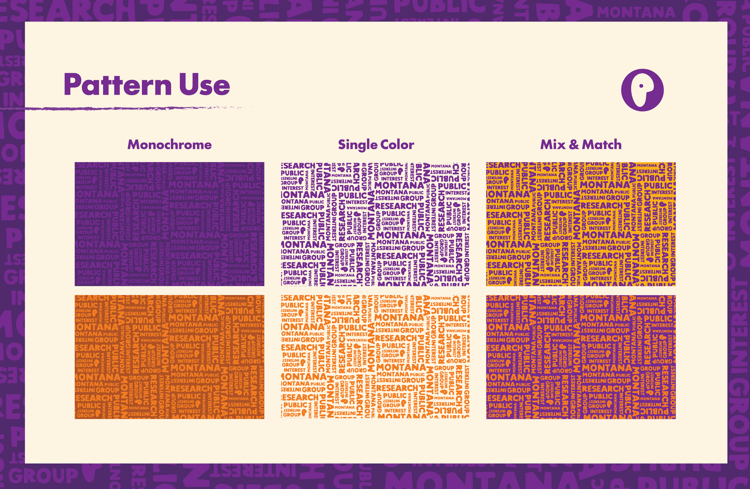
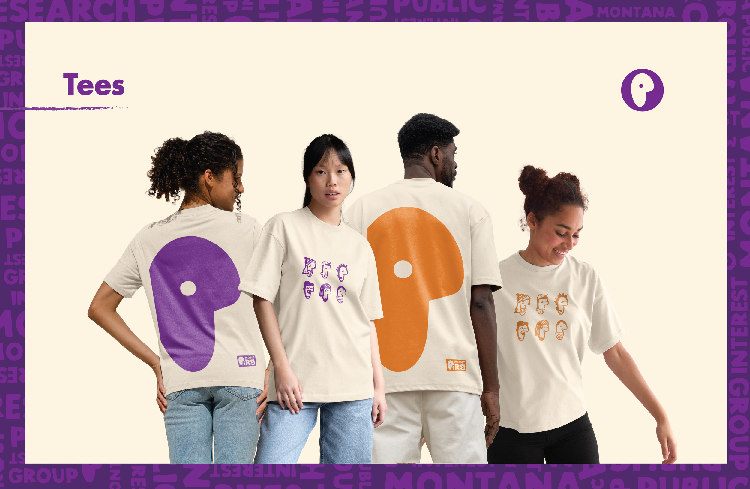
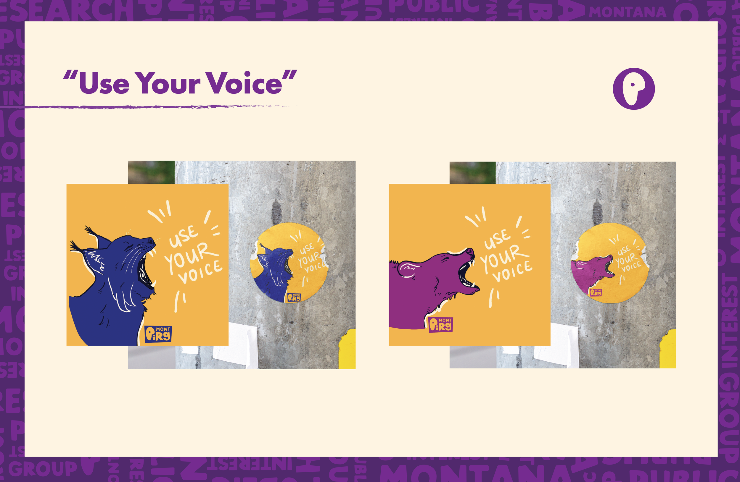
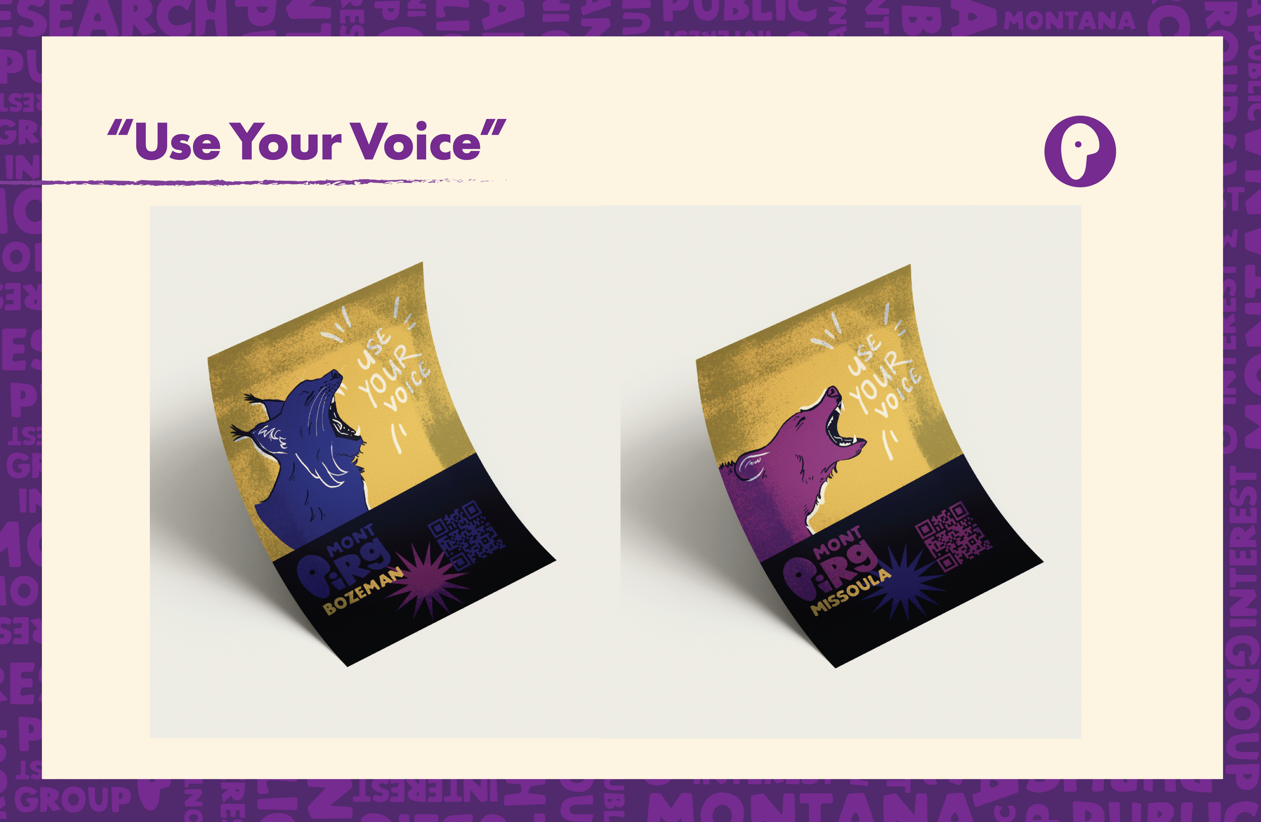
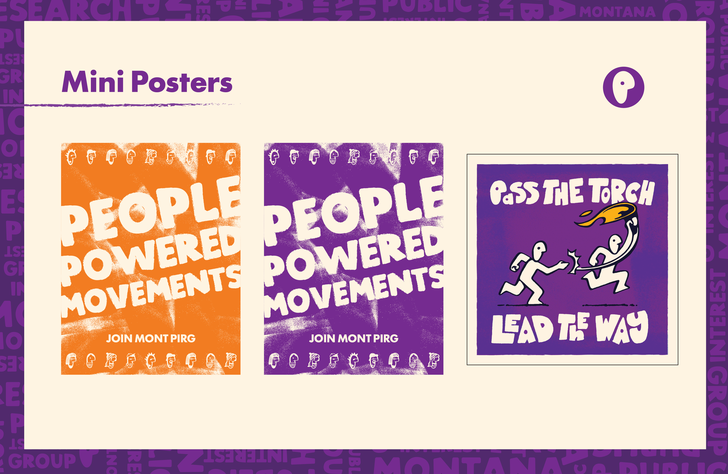
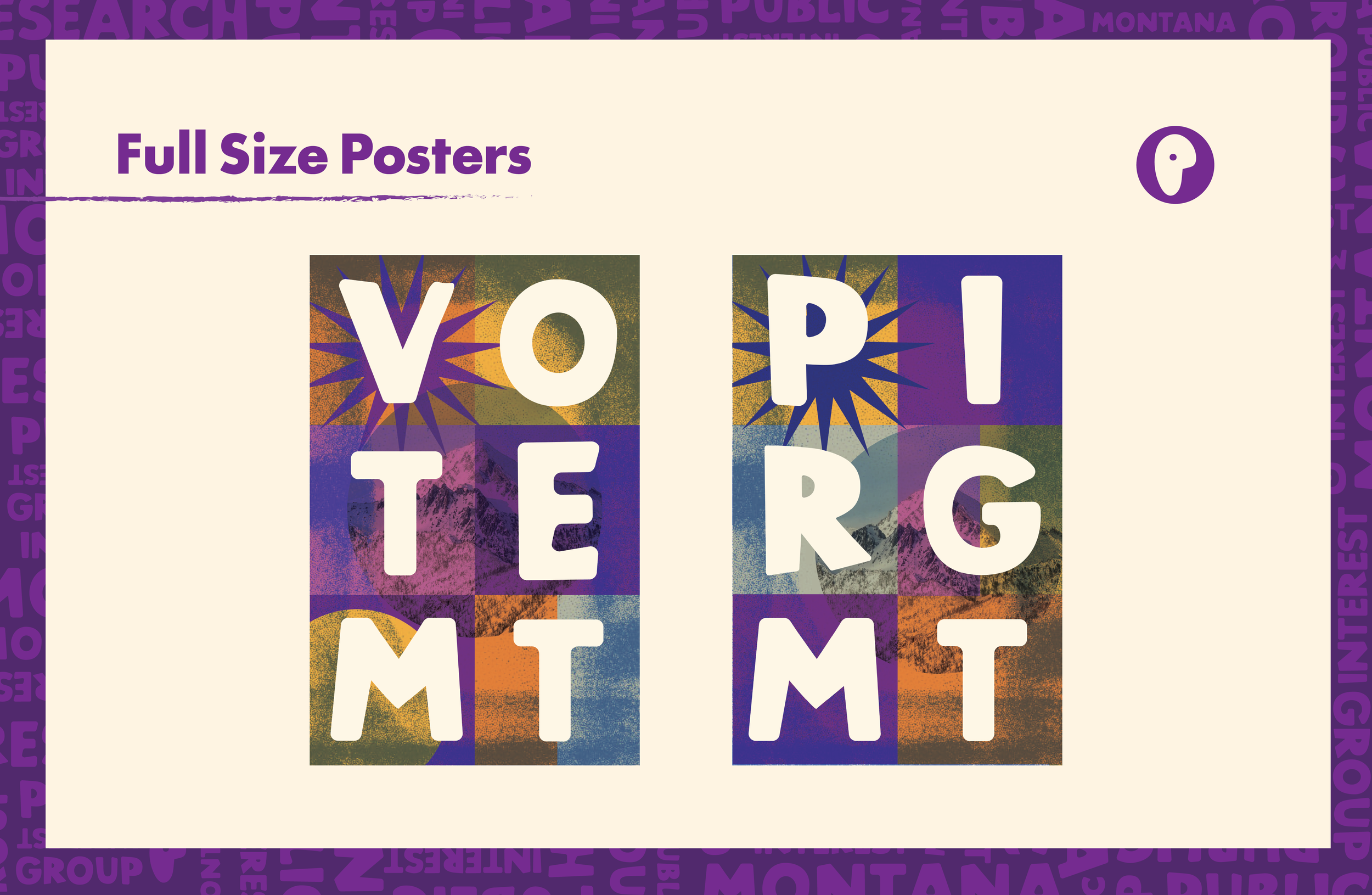
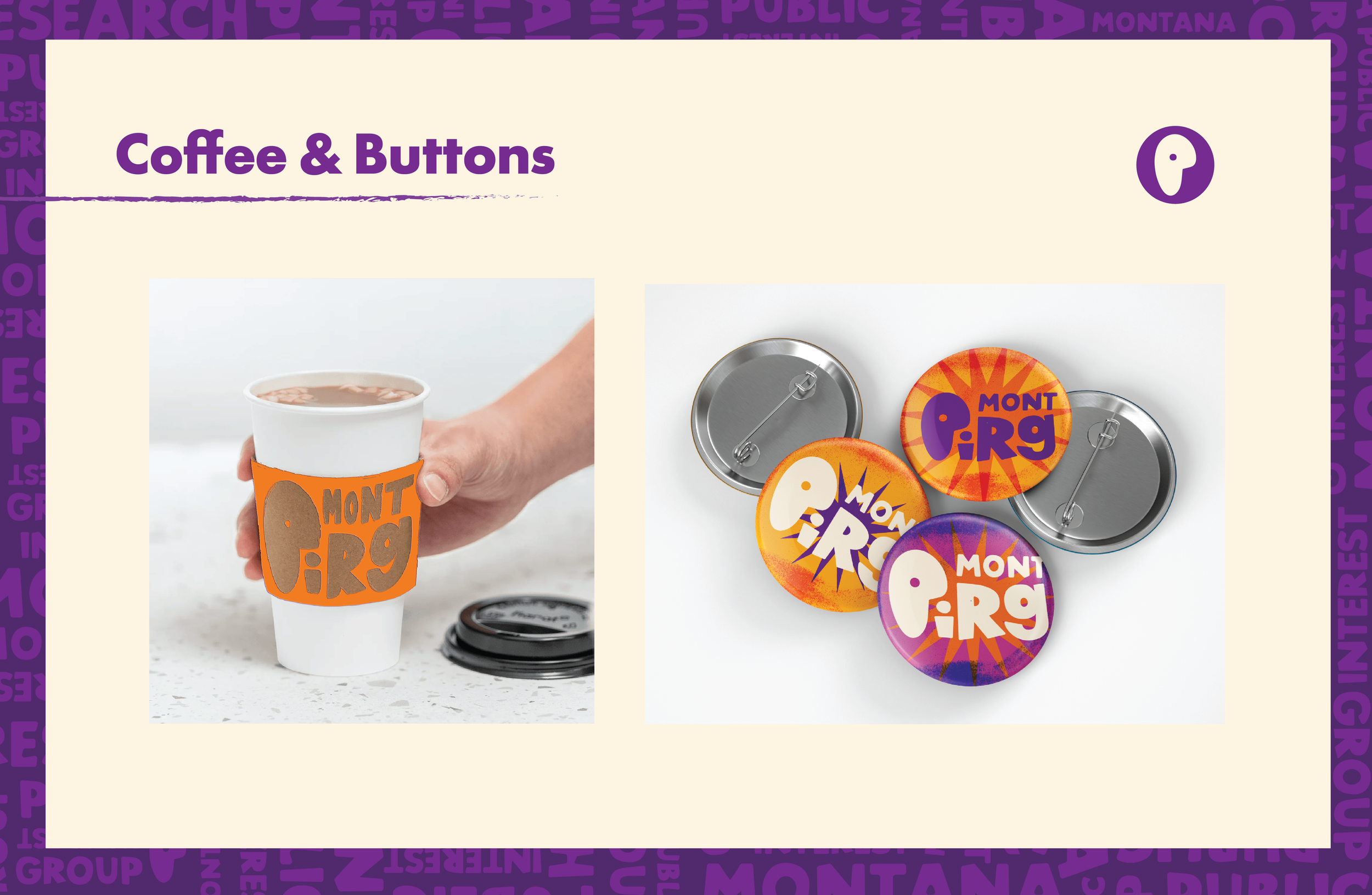
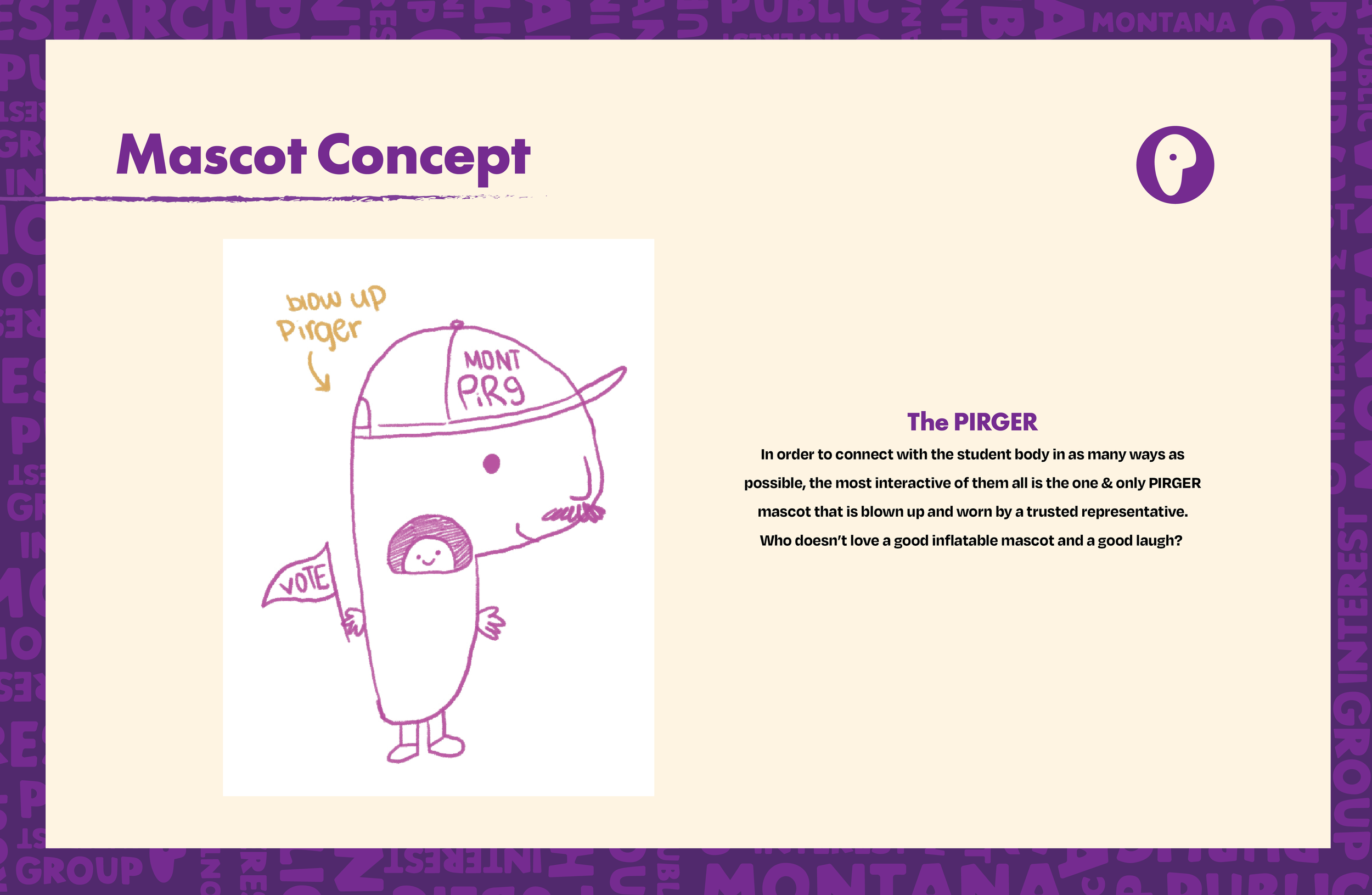
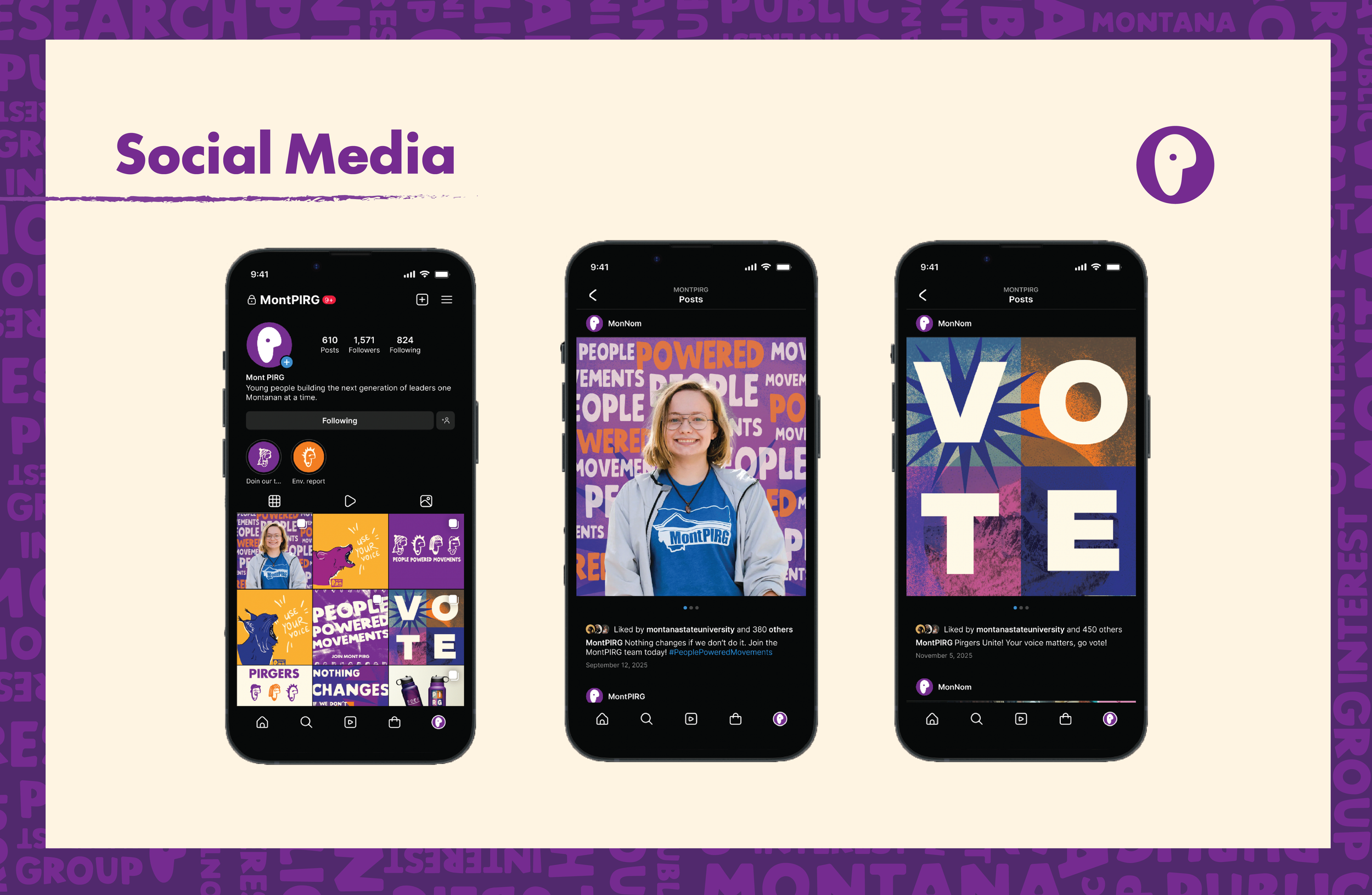
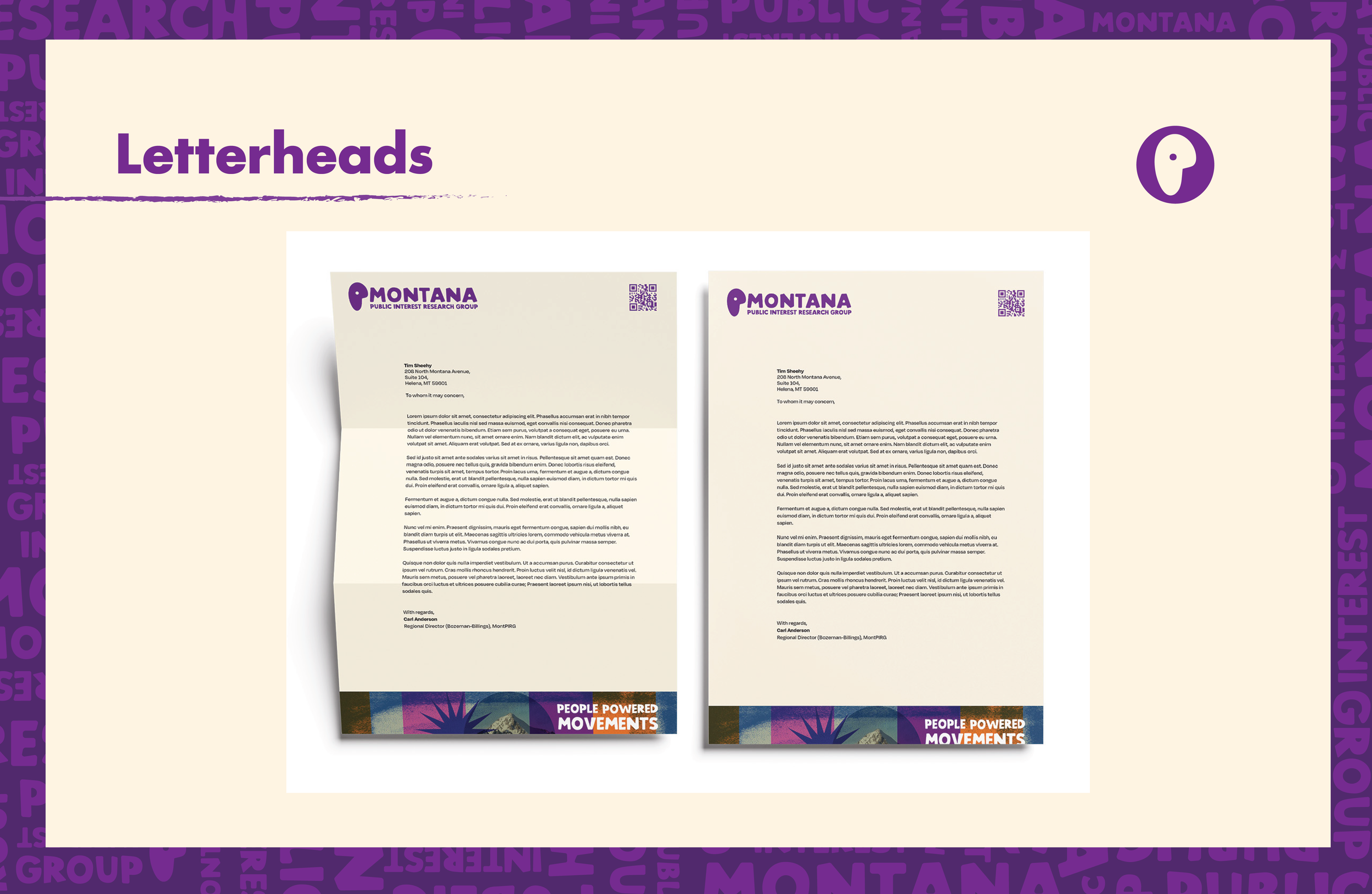
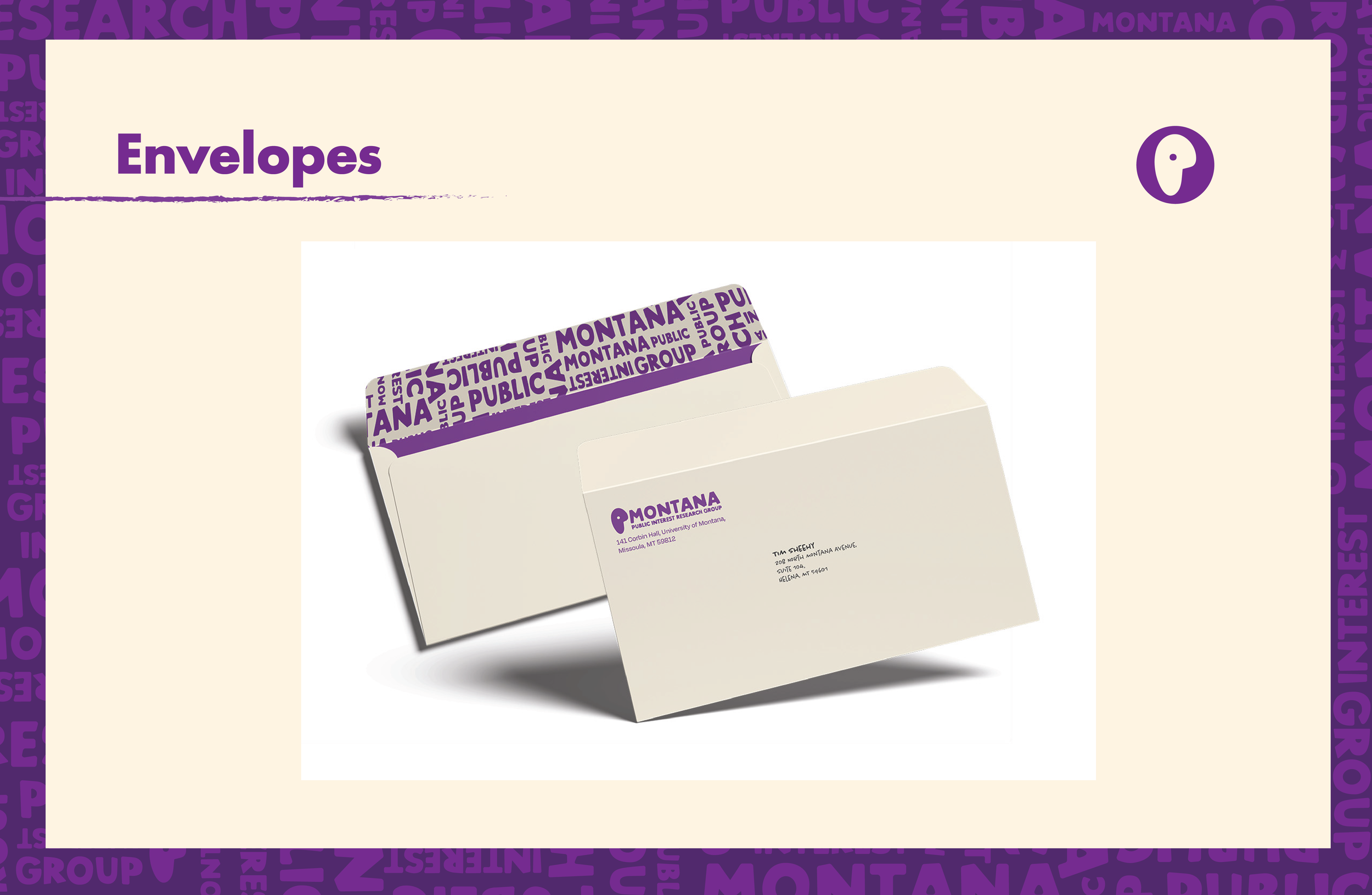
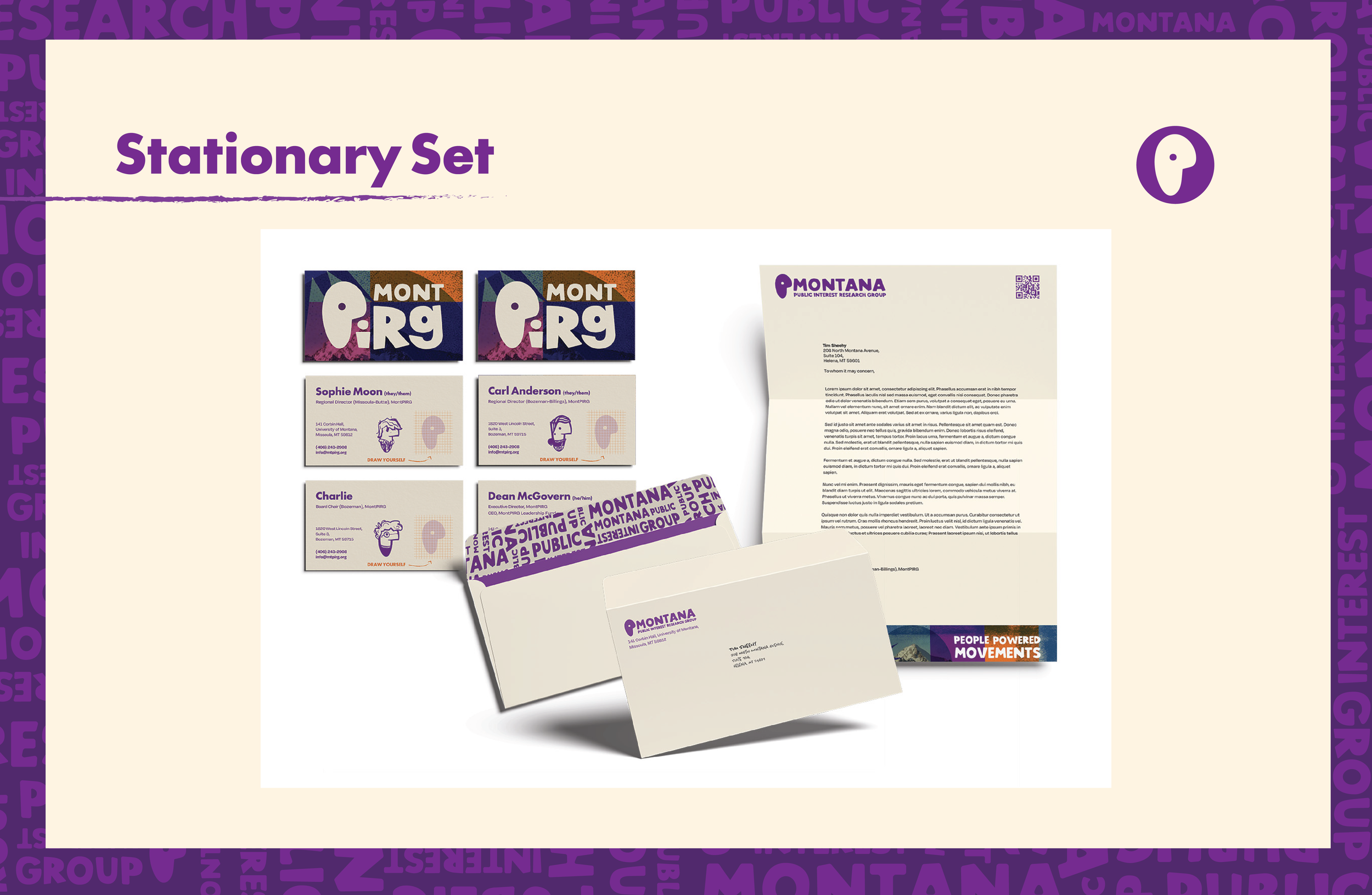
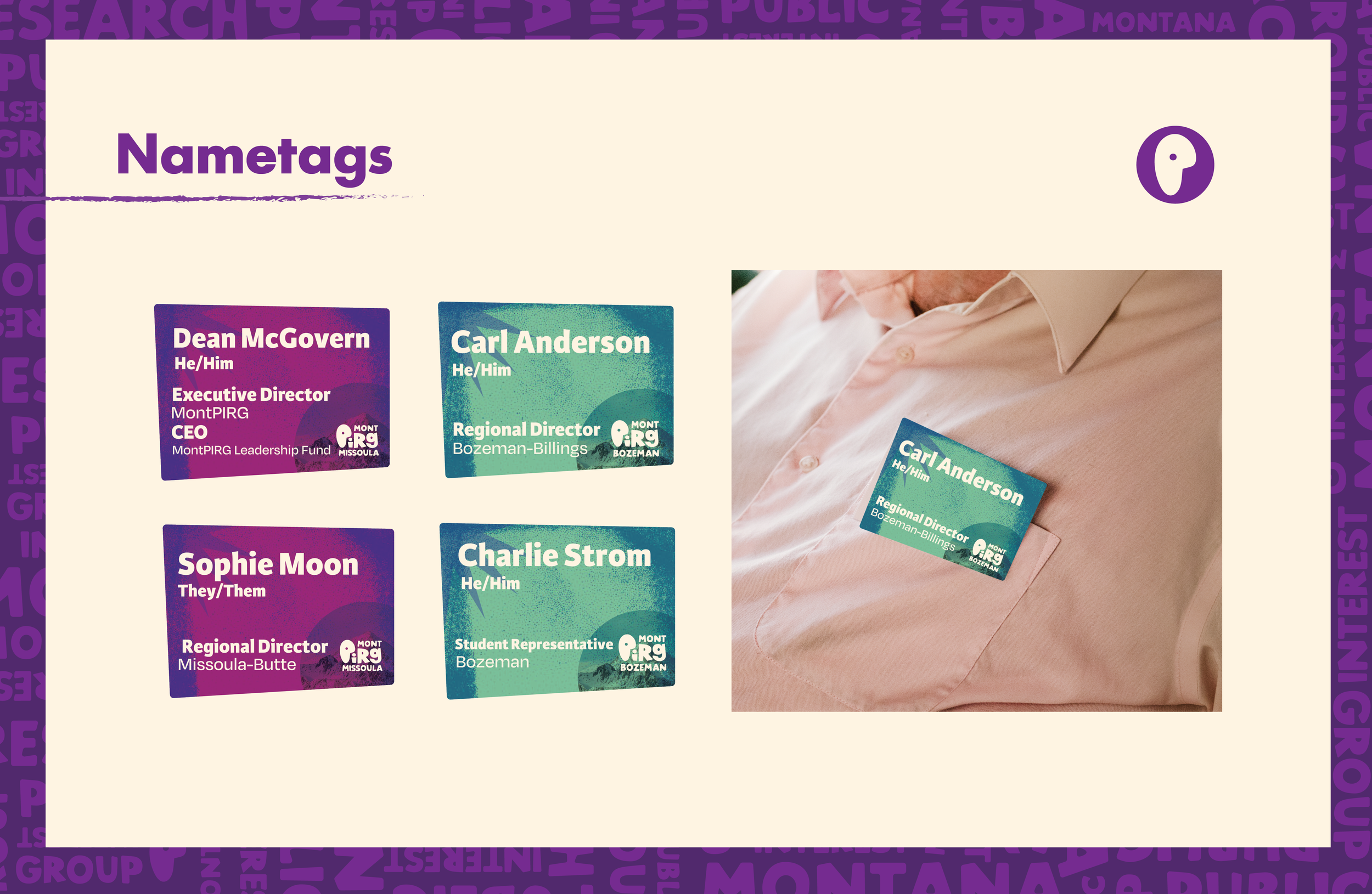
MontPIRG Rebrand
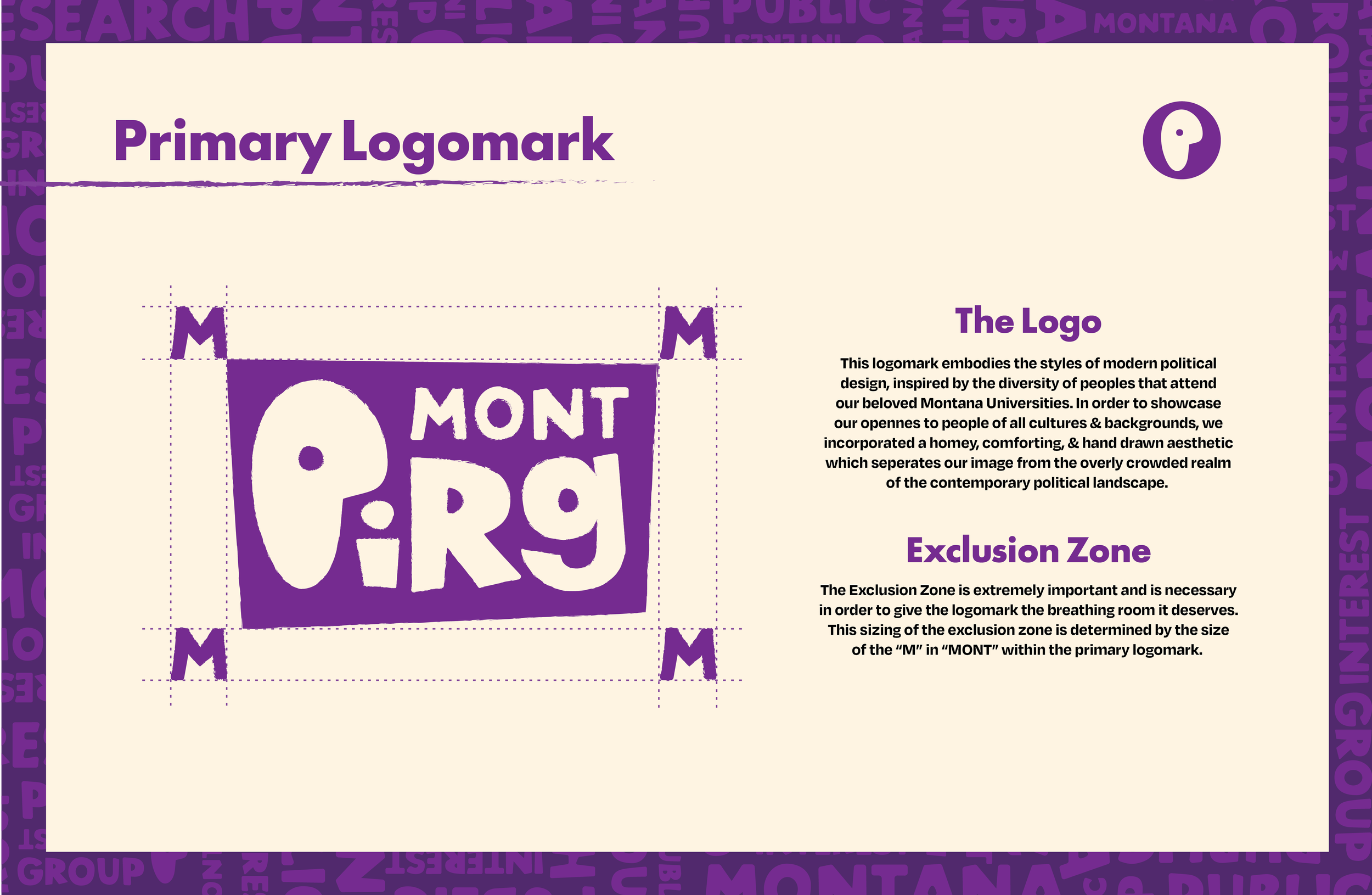
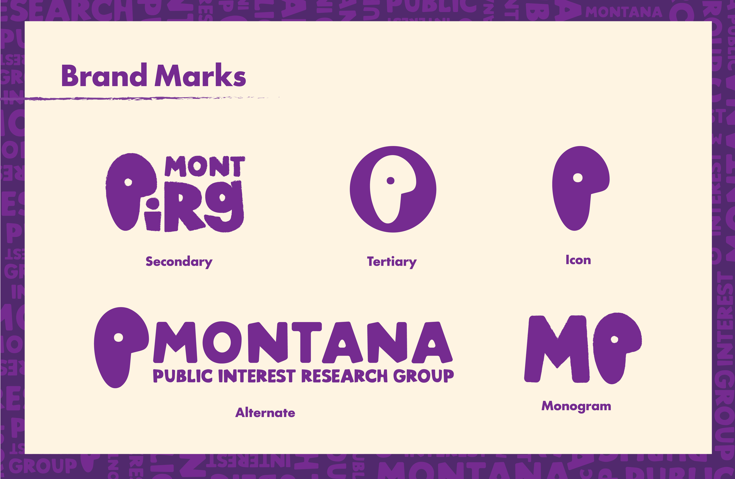
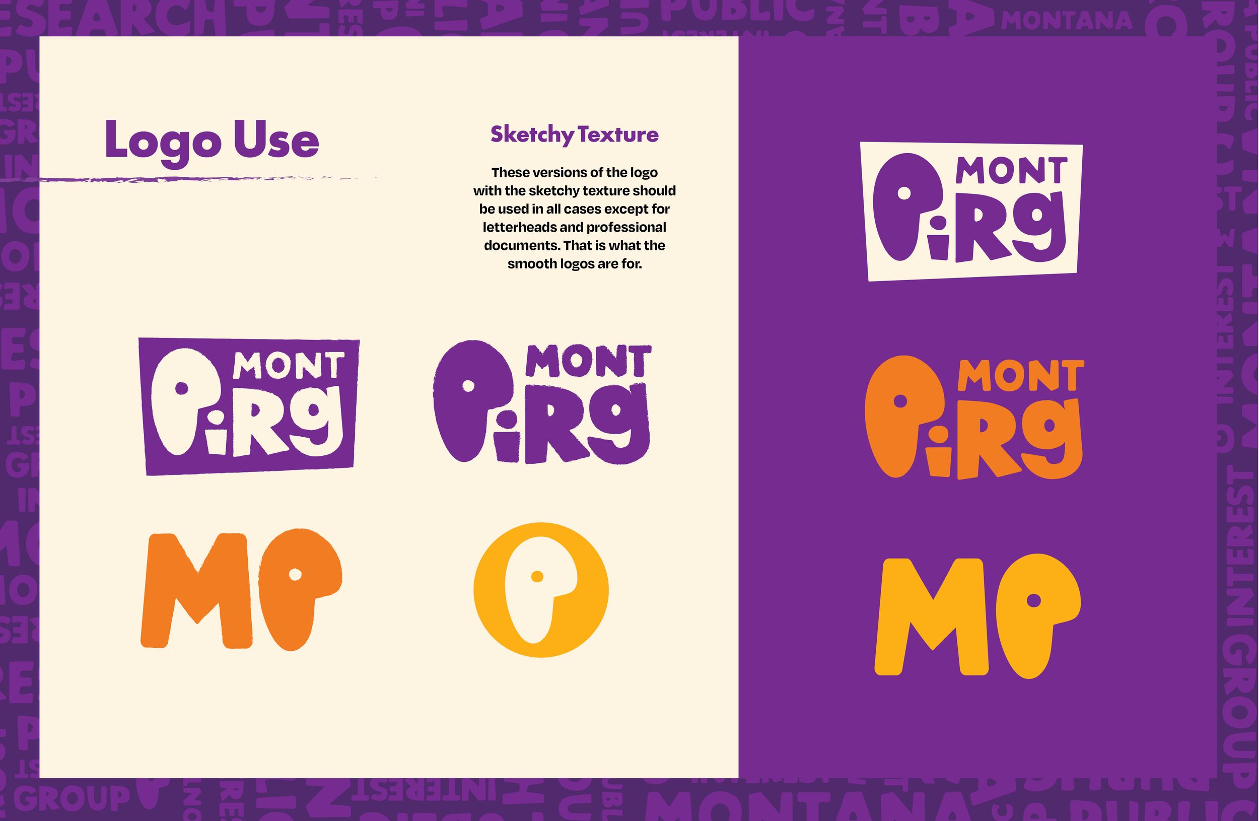
For our MontPIRG project, we completely rebranded the organization to create a more engaging, student-focused identity that feels approachable and energetic while still supporting its mission. We redesigned the logo system, color palette, typography, and visual language to move away from a traditional political look and toward something more bold, playful, and people-centered. The new brand emphasizes community, activism, and accessibility, with flexible assets that work across campuses, events, merchandise, and digital platforms. Overall, the rebrand shows how a strong identity system can help MontPIRG better connect with students and encourage involvement in public interest issues